Relative intelligence for investors

Easy, instant, and in-depth investment comparison for intelligent investing.

Compare any set of stocks, ETFs, and funds on the most flexible visual surface in the market, with hedge-fund-grade metrics ranked live across every timeframe.

Start Comparing No login needed

A new intelligence layer

EasyCompare's smart, in-depth market comparison unlocks a new layer of intelligence and portfolio improvements for investors from all kinds of backgrounds.

Professional-grade

Designed as a professional-grade tool, EasyCompare is the most intelligent visual and quantitative comparison platform for stocks and ETFs.

Unlimited watchlists

Create unlimited comparison watchlists and get instant relative intelligence, combining hedge-fund-level quantitative metrics with a smart, interactive visual layer.

Understand instantly

Immediately understand your portfolio, or track and compare any set of investment ideas in ways simply not possible before.

Smarter allocation

Gain the advantage of smarter asset selection and allocation, with more consistent performance, lower risk, and shallower loss profiles.

Avoid FOMO

Avoid FOMO by clearly seeing short- and long-term relative trends, instead of chasing speculative, hype-driven performance.

World's smartest visual comparison layer.
Achieve unparalleled relative clarity in seconds.

Overview of the EasyCompare visual comparison surface and its main features
01

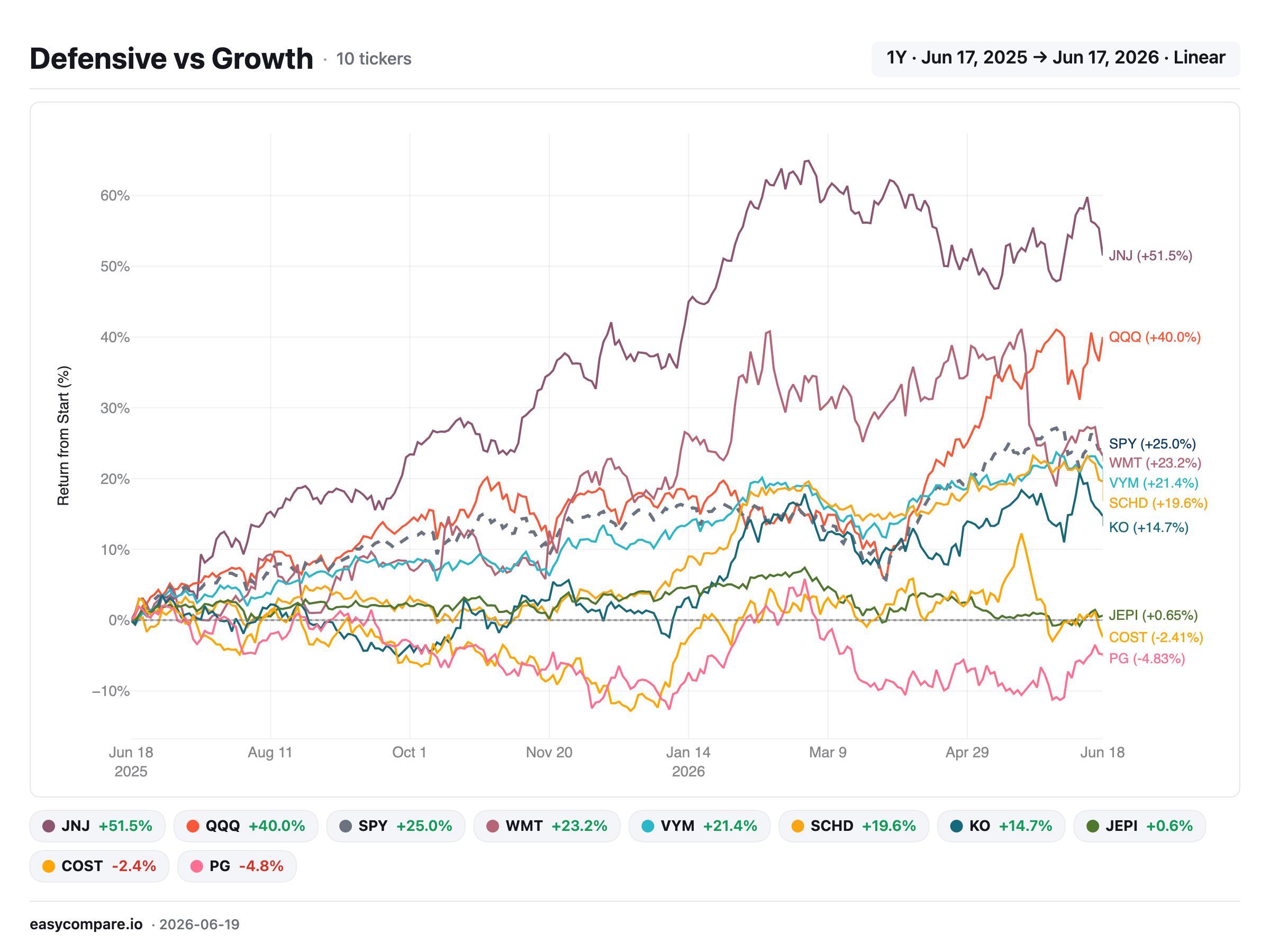
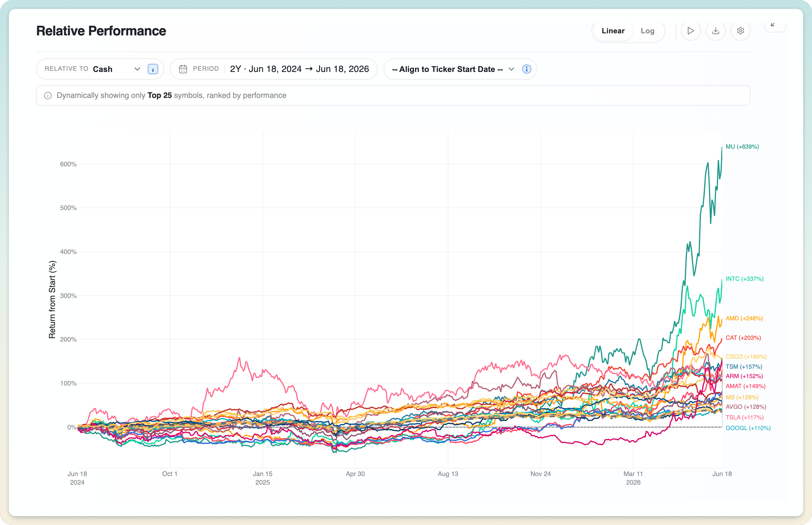
Interactive, high-contrast relative performance plots

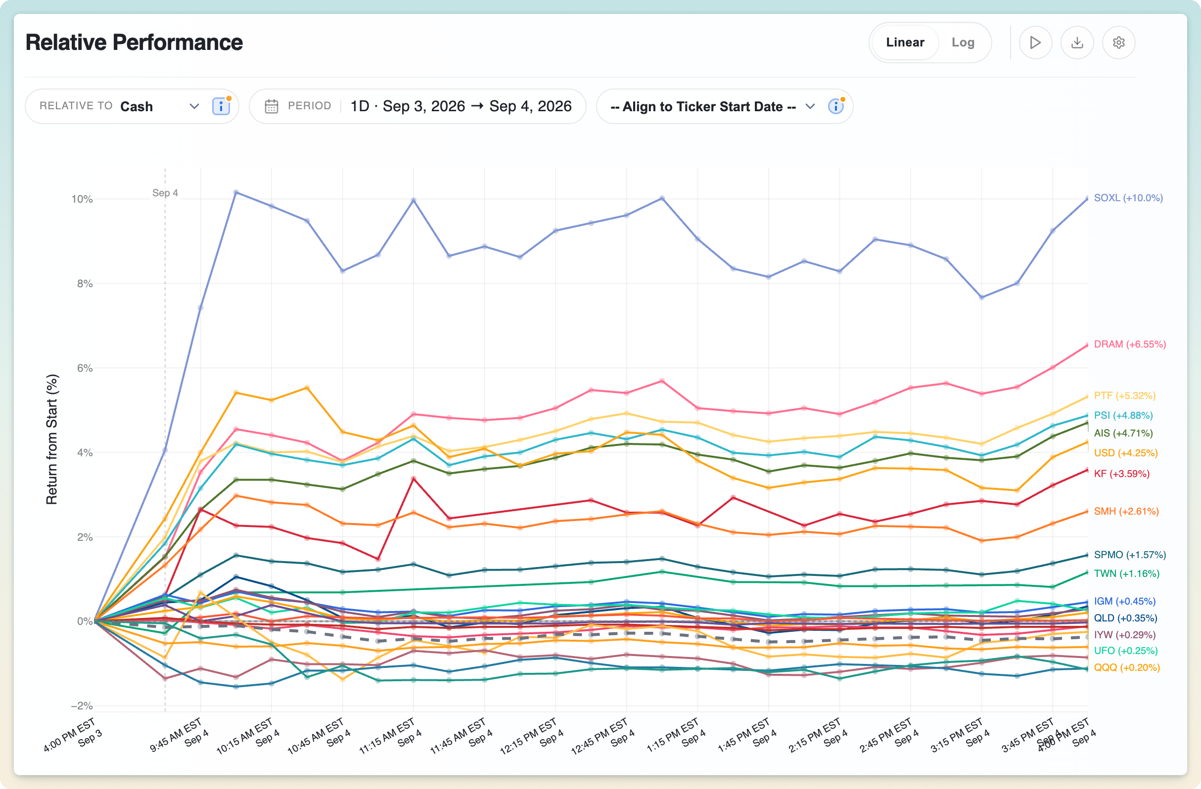
A high-contrast relative performance chart comparing several tickers

Every ticker is normalized to 0%, so you compare pure returns rather than prices. A $3,000 stock and a $30 ETF stand on equal footing. The chart stays crisp and readable whether you're looking at three tickers or several dozen.

02

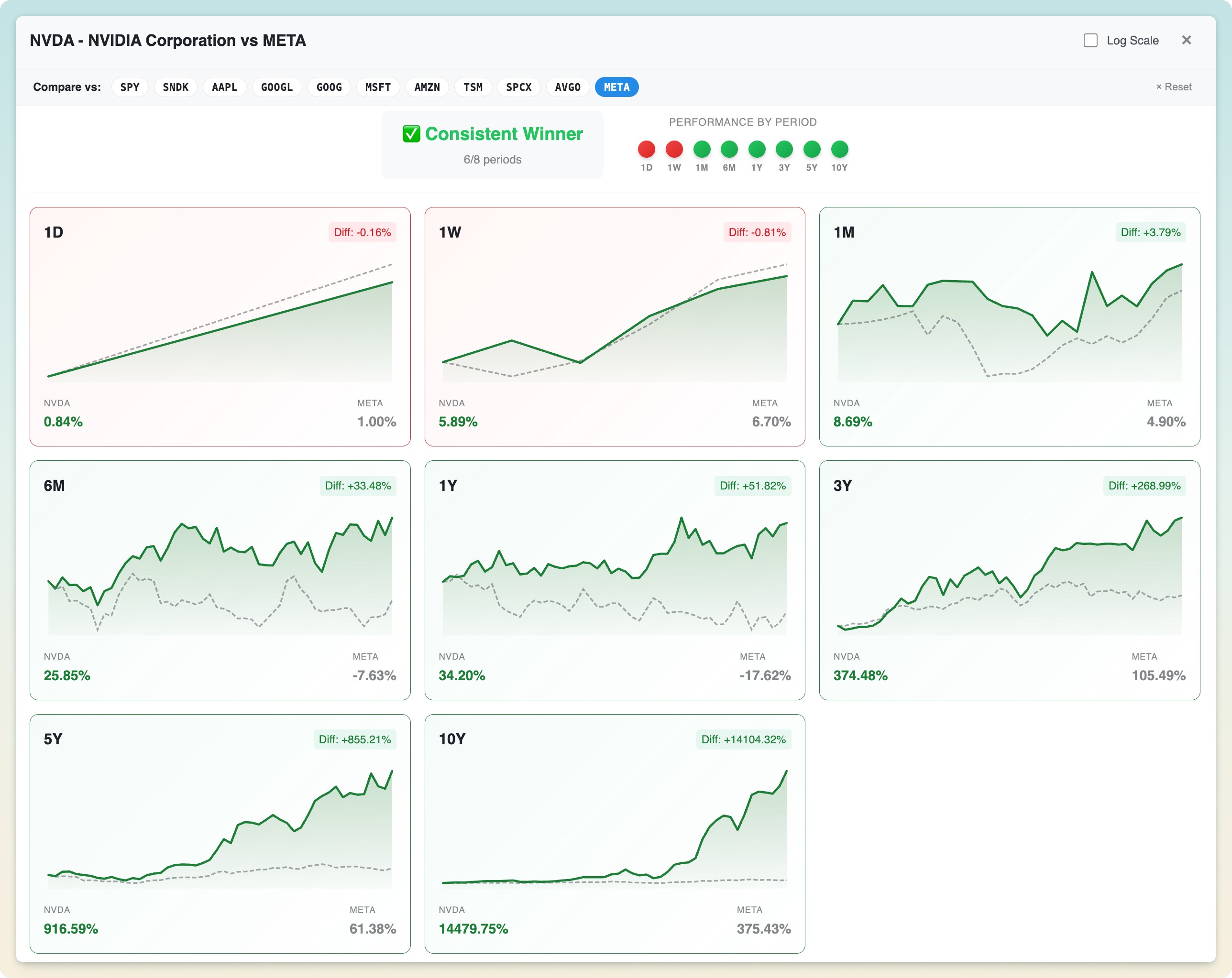
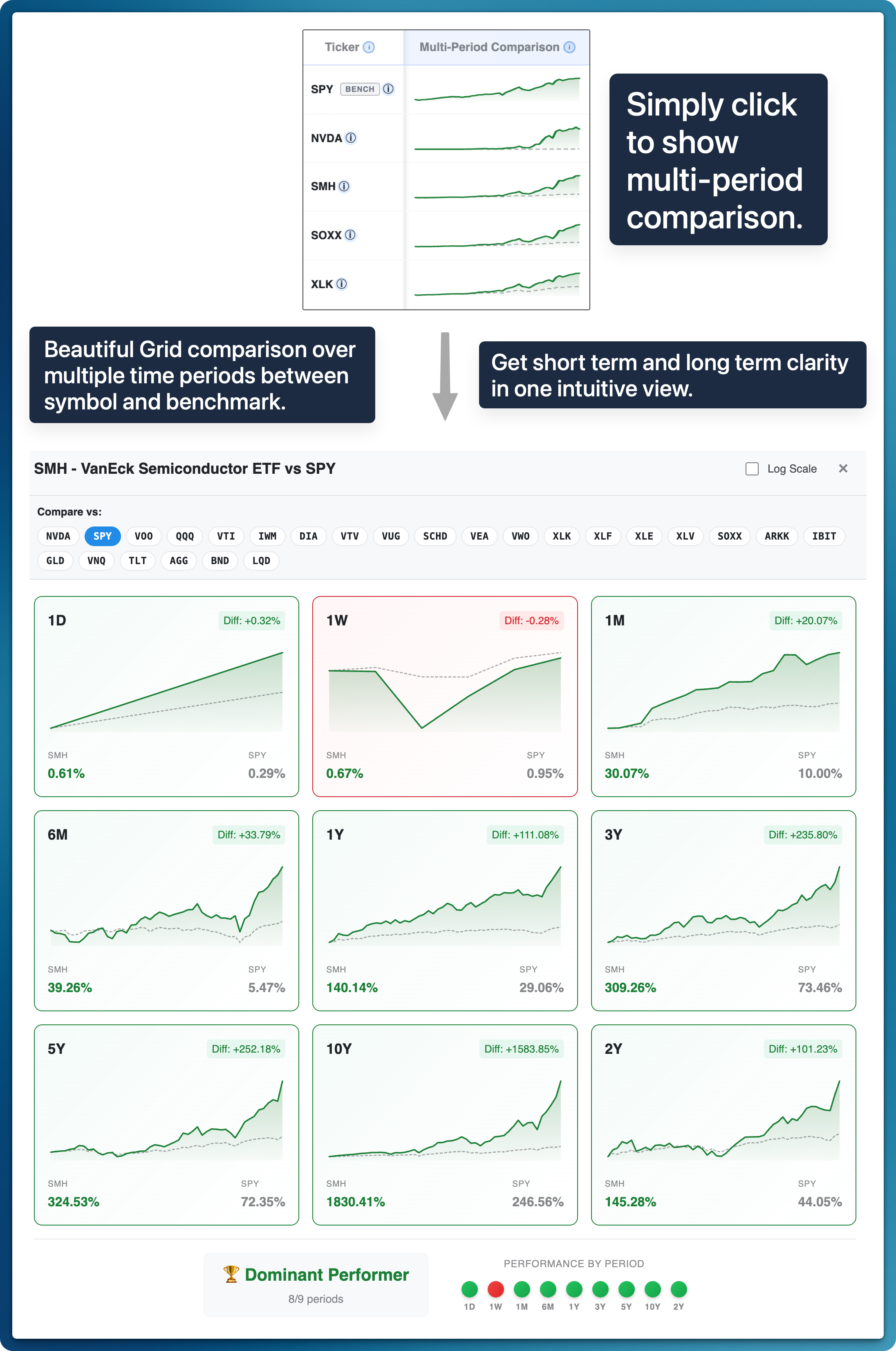
Compare any two investments across every timeframe in one visual

NVDA compared with META across eight short- and long-term periods with a dominance summary

See short- and long-term performance together in one grid, with a period-by-period dominance summary that reveals consistency at a glance. Choose another comparison ticker inside the modal to test any matchup instantly.

03

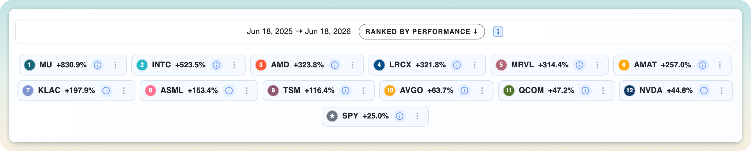
An auto-ranked legend that surfaces the top performers

The legend automatically sorted to show top performers first

The legend automatically sorts by performance for the current time preset, so the leaders and laggards are obvious at a glance, with no manual sorting required.

04

See ranked performance at any moment, just by hovering

Move your cursor anywhere on the timeline and the ranking re-orders to that instant, so you can read who was winning at any point in history, not just today.

05

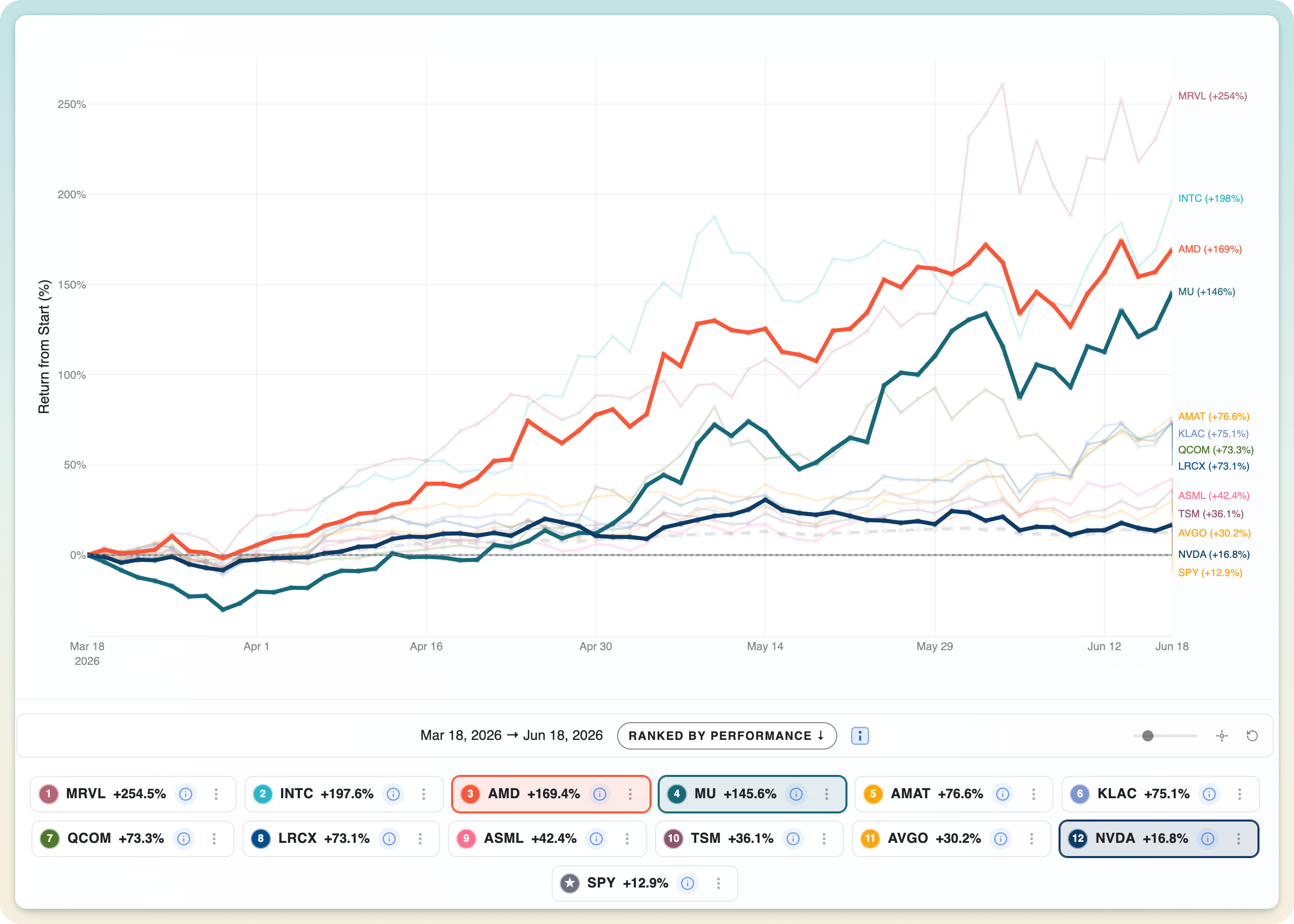
Highlight and pin any tickers with a click

Clicking legend tickers to highlight and pin them on the chart

Click any legend chips to pin and emphasize the tickers you care about while the rest dim back. It's a fast way to test multiple ideas across a busy watchlist.

06

Hover to instantly highlight time series in the chart

Move your cursor over any line and EasyCompare instantly highlights that ticker's full time series while the rest fade back, so you can trace a single path through a crowded chart without losing the comparison.

07

Focus on a narrow subset of your watchlist

The Focus control lets you zero in on a chosen handful of tickers from a larger watchlist, then snap back to the full picture in one click.

08

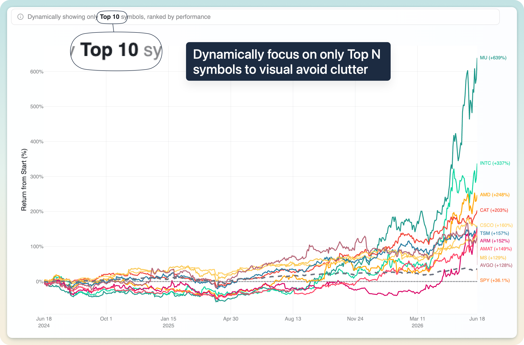
Dynamic top-performer pruning for large lists

Dynamically showing only the top N performing tickers on the chart

When you're comparing dozens of tickers, show only the top N performers on the chart to avoid spaghetti, while the legend and rankings table still show everyone.

09

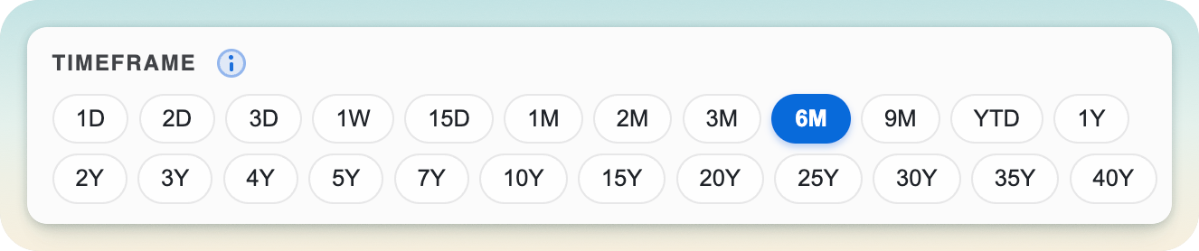
22 presets, from 1 day to 40 years

The full set of 22 time presets from 1 day to 40 years

A deep set of 22 short- and long-term presets: 1D, 1W, 1M, YTD, 1Y, 5Y, all the way to 40 years. One click and the chart, table, and rankings recompute instantly.

10

Intraday comparison and trends

1D, 2D, and 3D presets switch to 15-minute intraday data, measured from the previous close, so you can read exactly how tickers move during selloffs, rallies, and earnings.

11

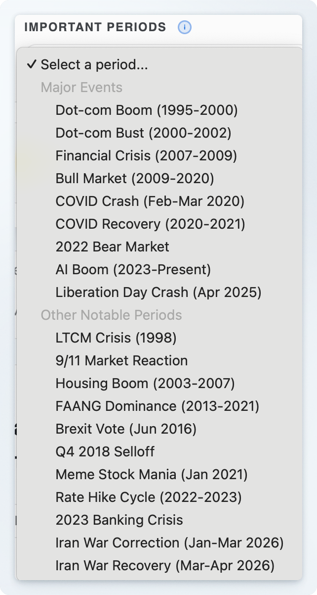
Stress-test across curated bear and bull markets

Stress-testing a watchlist across curated bear and bull market periods

Replay any set of investments through curated historical events (bear markets, recoveries, crashes) to see which holdings amplify losses and which hold up.

12

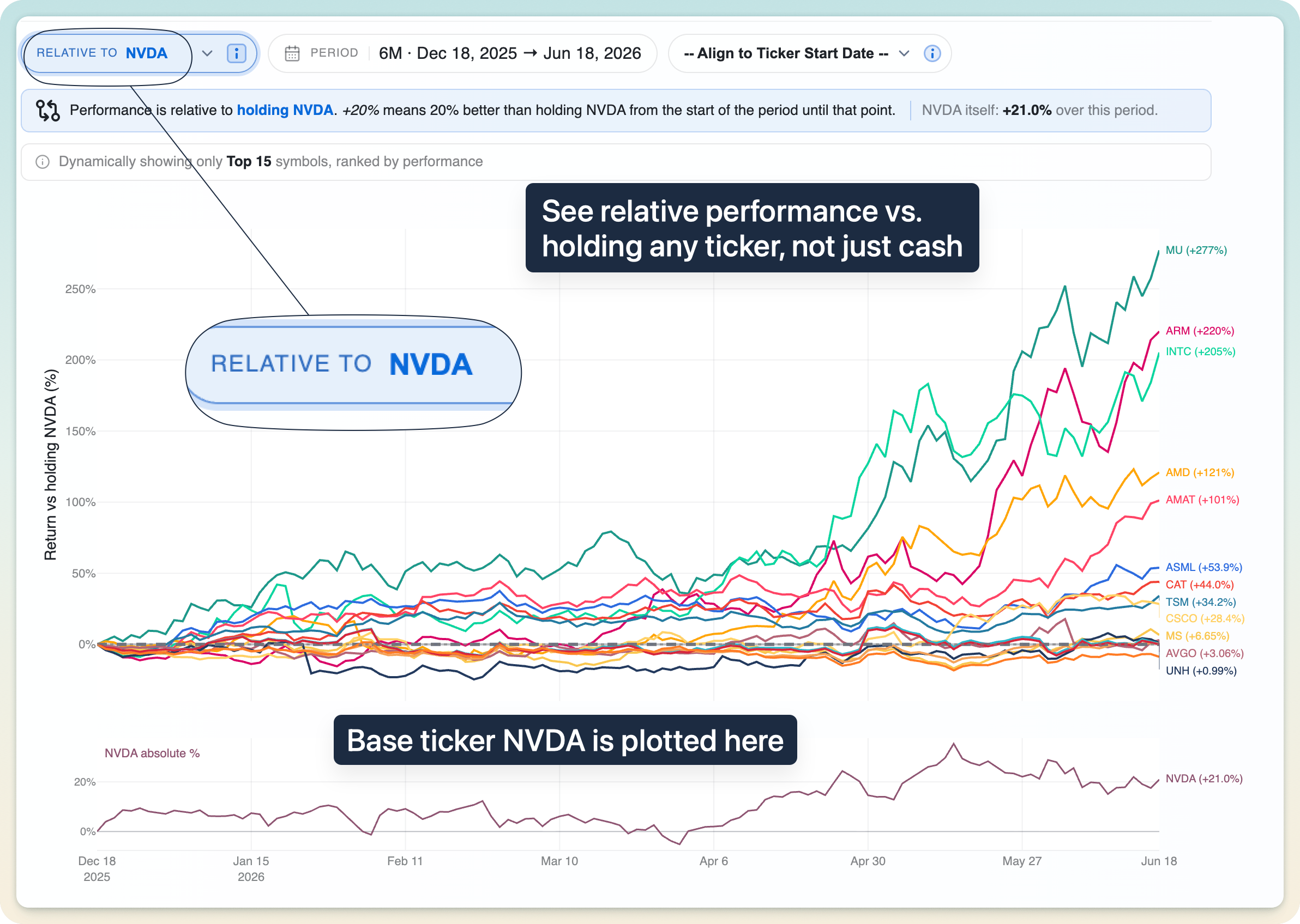
Compare everything relative to holding any other asset

Rebasing every ticker to measure performance relative to another holding

A unique capability: measure every ticker against holding a different asset, not just cash. Instantly answer "would I have been better off just holding SPY (or NVDA) instead?"

13

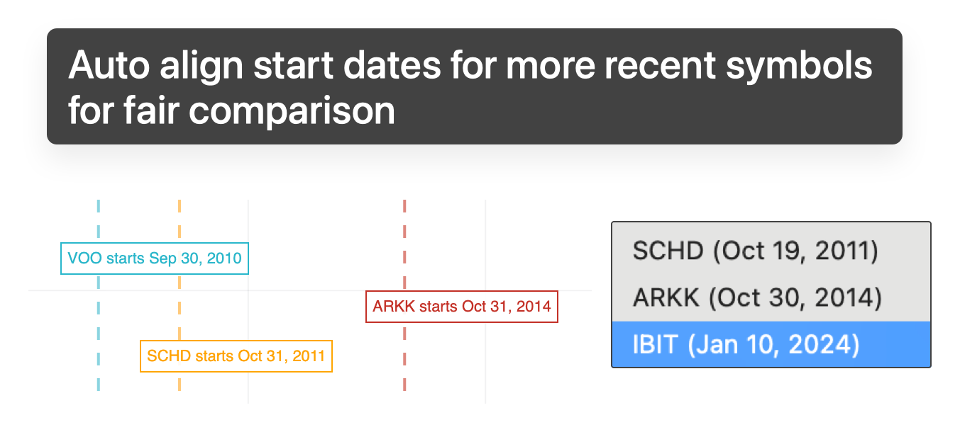
Automatic alignment for late-starting assets

Aligning all tickers to a common start date for a fair comparison

When tickers have different histories, rebase them all to a common starting date for a fair, apples-to-apples comparison, with a clear marker showing where each one's data begins.

14

Download and share a polished PNG of your comparison

A downloaded comparison chart PNG with branding, legend, and timeframe details

Export a cleanly designed image of any visual comparison: branded, labelled, and ready to drop into a note, a thread, or a deck.

15

A dedicated benchmark line in every visual

A distinctly styled benchmark line (SPY by default, configurable per set) appears across every chart and table, giving you instant market-relative context.

16

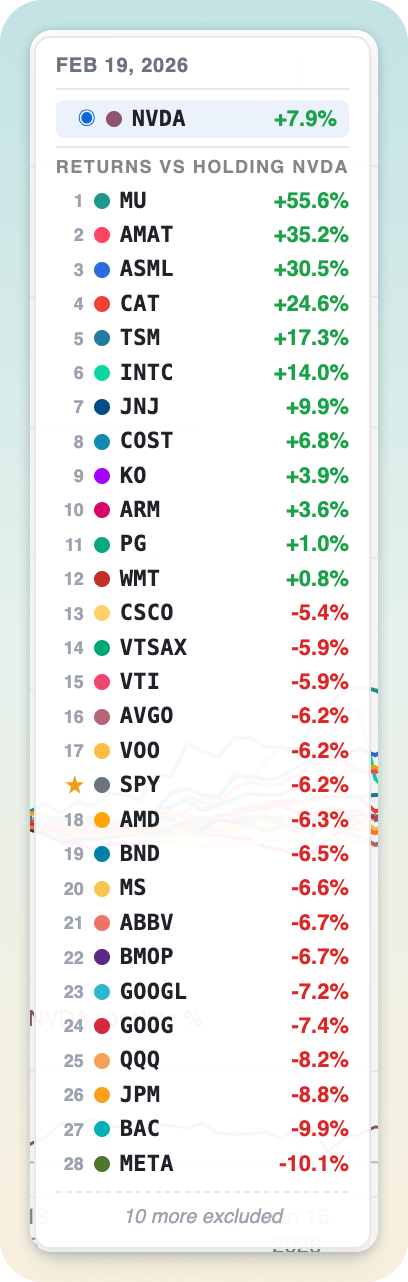
A smart return hover list right on the chart

A sorted summary of every ticker's return shown on top of the chart

A compact panel pinned to the chart shows every ticker's return at your cursor, sorted leader-first, so "who was up the most on this date?" is answered the moment you hover.

A detailed Quantitative Rankings & Visual Insights table for easy multi-dimensional comparison.

Compare across hedge-fund-level metrics and multi-time-period performance, all in one place.

01

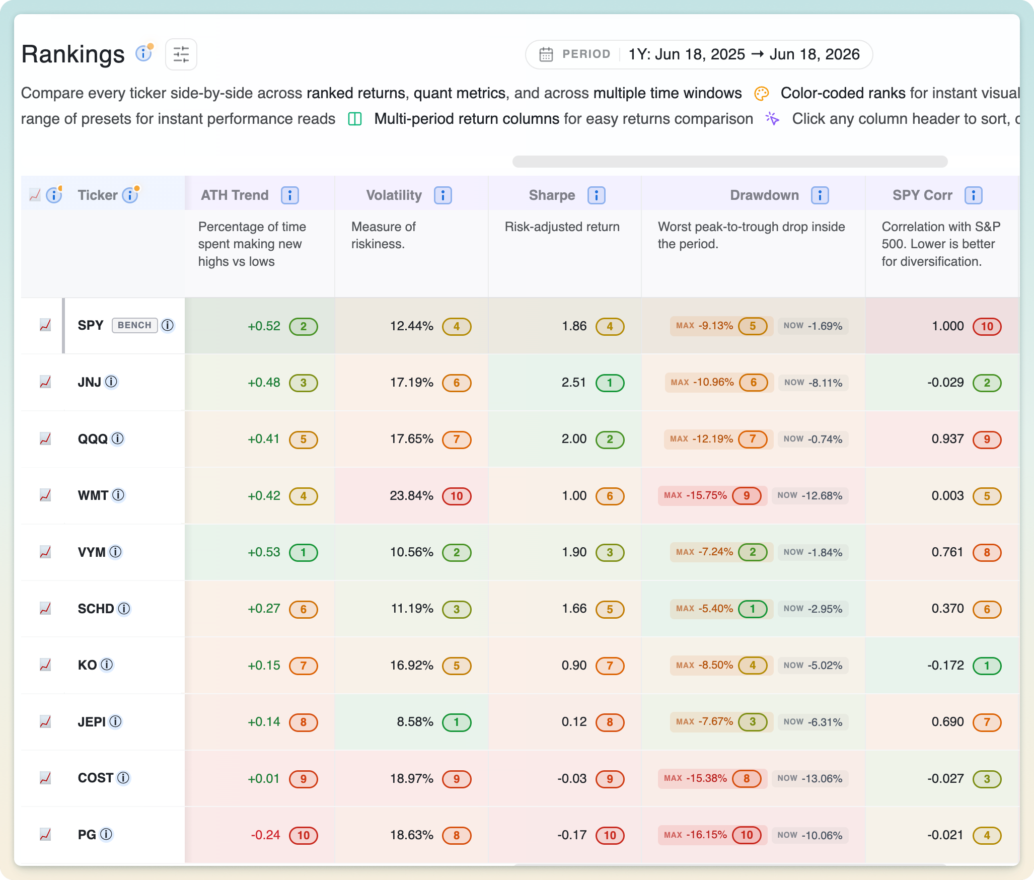
Rankings

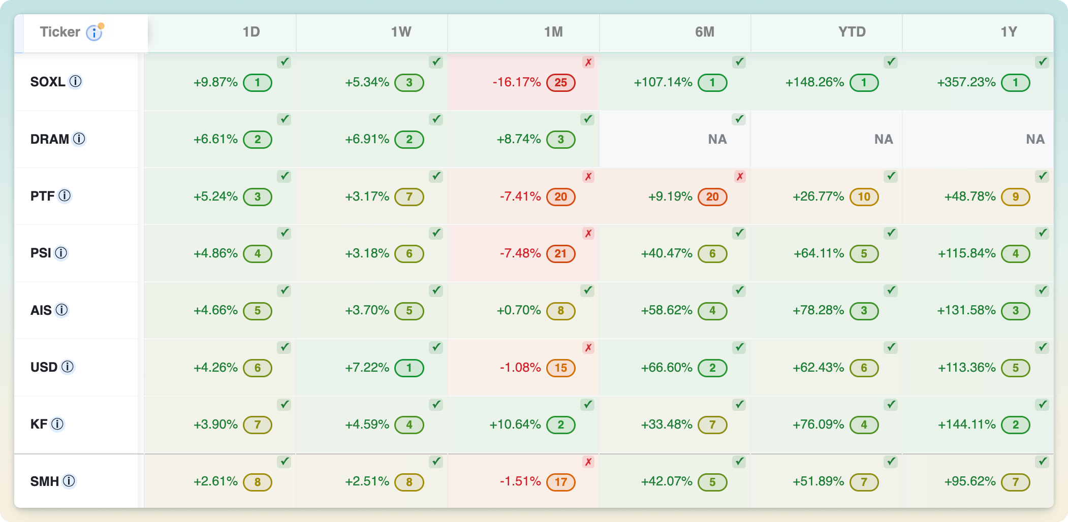
Every quantitative metric ranked and color coded across the comparison table

Every ticker is ranked across whatever metric you sort by: return, Sharpe, drawdown, market cap, and more. One click sorts, another reverses, and the whole table re-ranks instantly when you change tickers or timeframe.

02

Color coded

Green-to-red color coding revealing stronger and weaker values across ranking metrics

Values and ranks are color-coded throughout the table (green for strength, red for weakness), so the leaders and laggards in any column stand out without reading a single number.

03

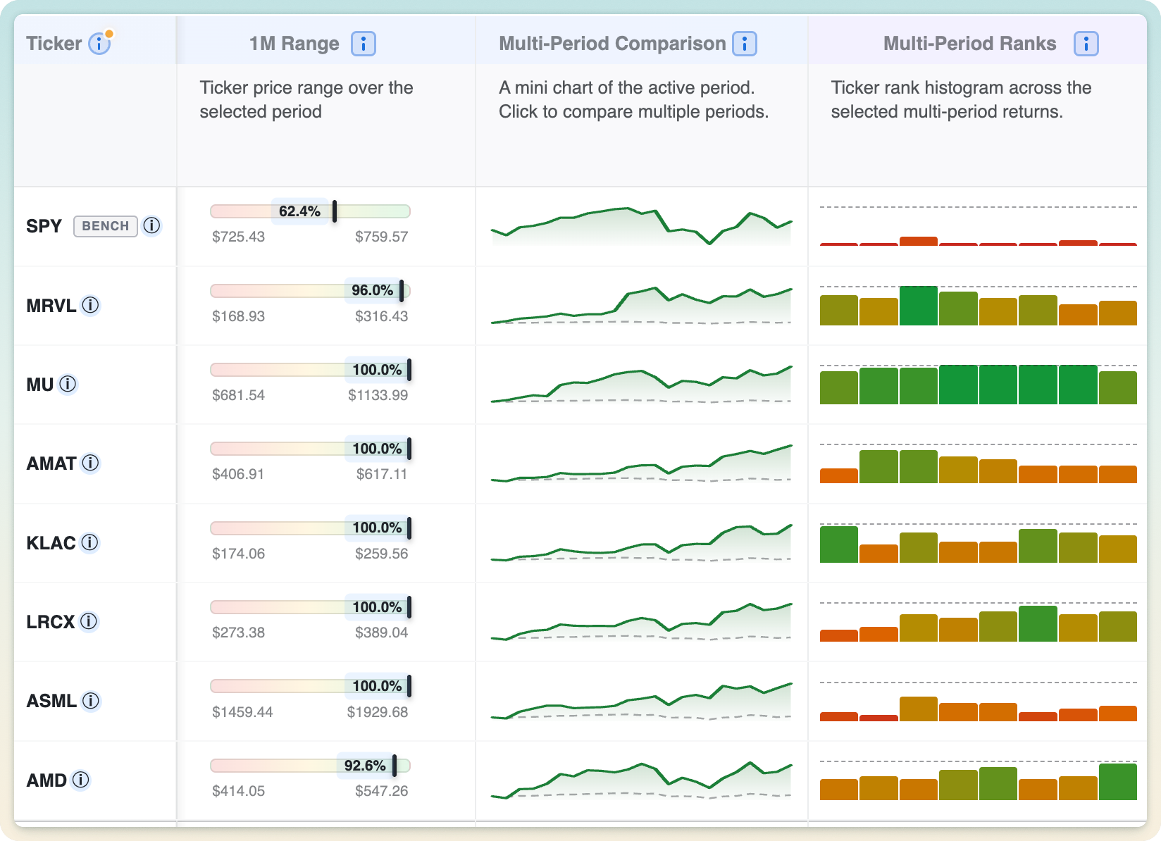
Sparkline charts with benchmark comparison

Sparkline charts comparing each ticker across different time periods

Each row carries a mini chart of the ticker's path over the active period, drawn against the benchmark so out- and under-performance reads at a glance. Click any sparkline to expand it and compare multiple periods side by side.

04

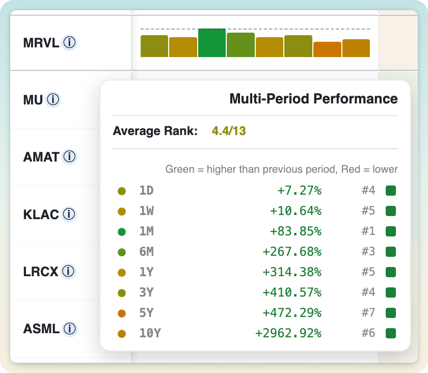
Multi-period ranking histogram

A multi-period ranking histogram with returns and rank for each timeframe

A compact histogram shows how each ticker ranks across every selected time period at once, so you immediately see relative rankings across all time periods, and can tell a consistent all-around performer from a one-window wonder.

05

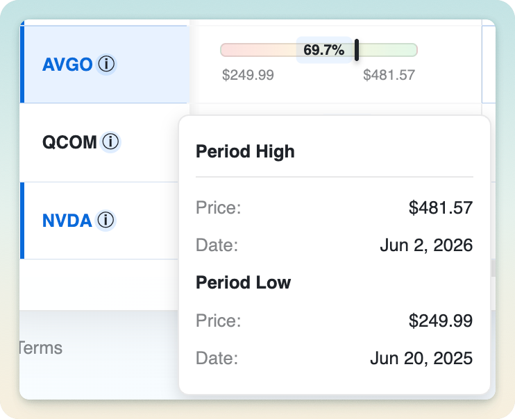
Visual price range across any time preset

A ticker's current position between its high and low for the selected period

A visual bar shows where the current price sits between the period's low and high. Toward the right and the ticker is near its peak; toward the left and it's closer to its lows. Handy for spotting potential value or stretched names.

06

Hedge-fund-level quantitative metrics

Sharpe ratio, volatility, drawdowns, correlation, CAGR and more: the same risk-adjusted measures professional desks rely on, computed for every ticker over your exact timeframe.

07

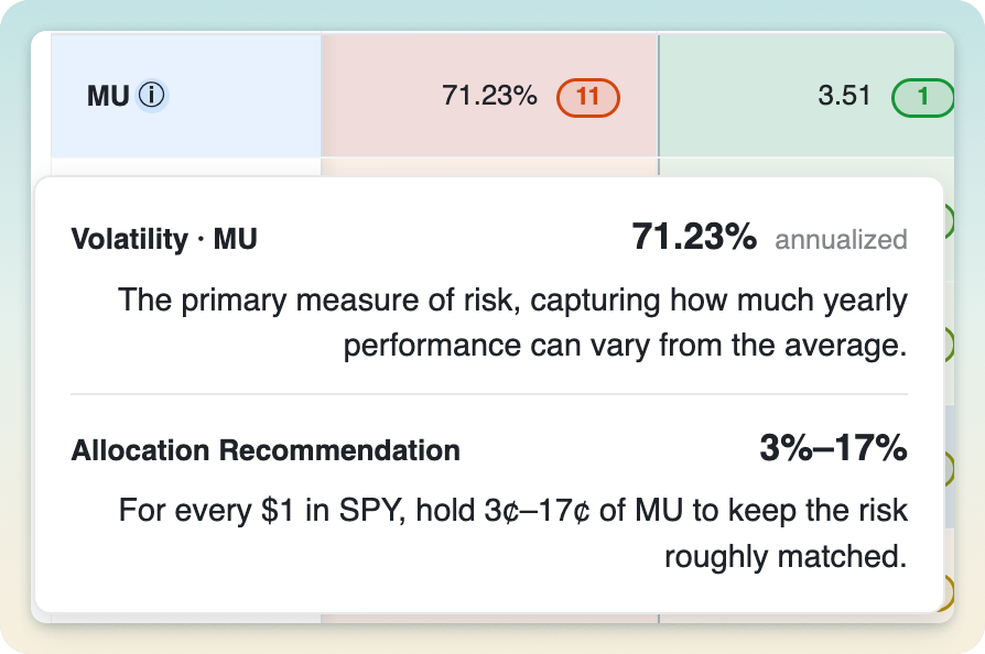
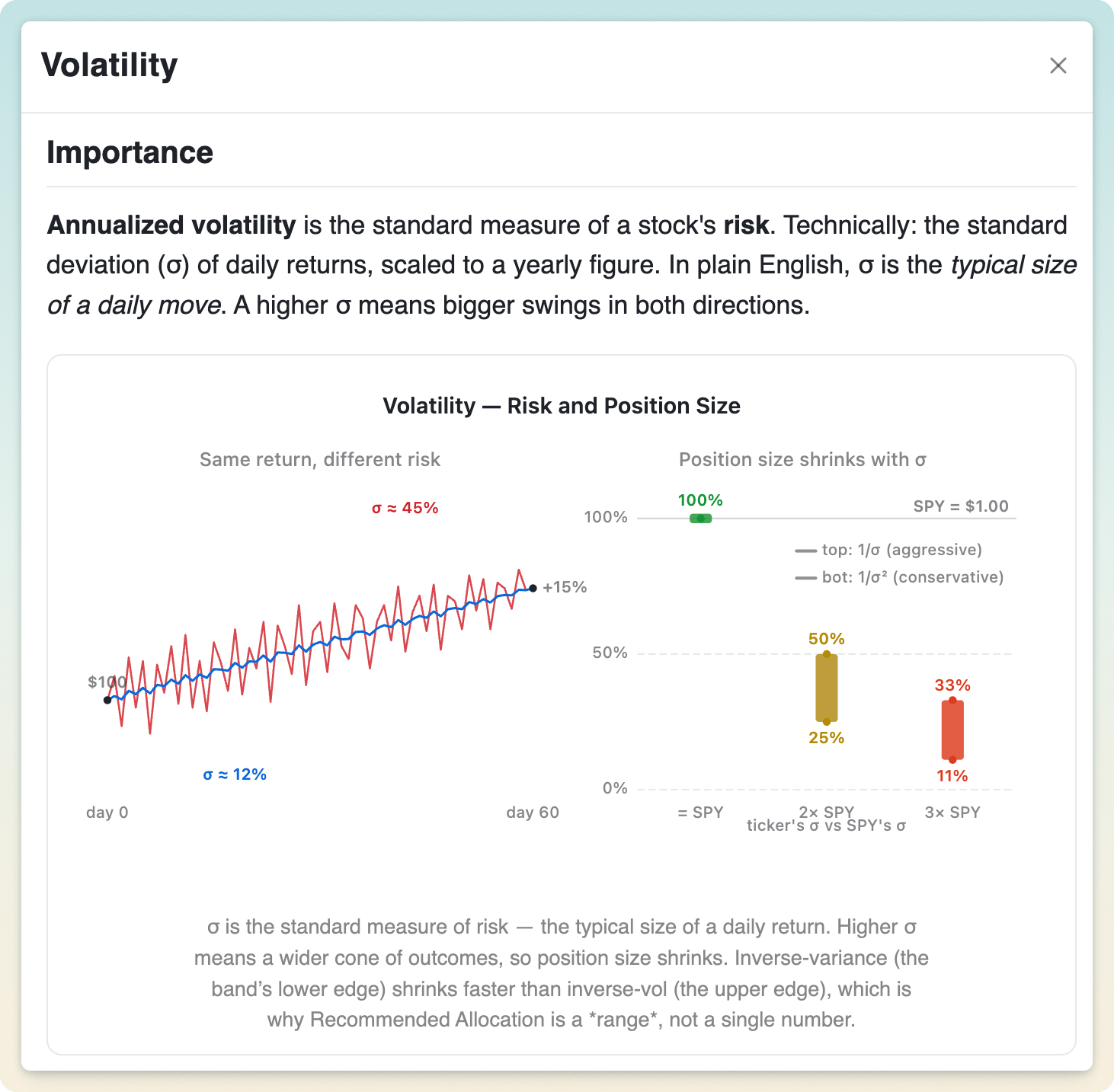
Volatility and allocation guidance

Volatility details with risk-matched allocation guidance relative to SPY

See how much each ticker swings (annualized volatility), then get a risk-aware sizing range versus SPY based on that relative volatility. It turns "how risky is this?" into "roughly how much should I hold?"

08

Easy diversification evaluation

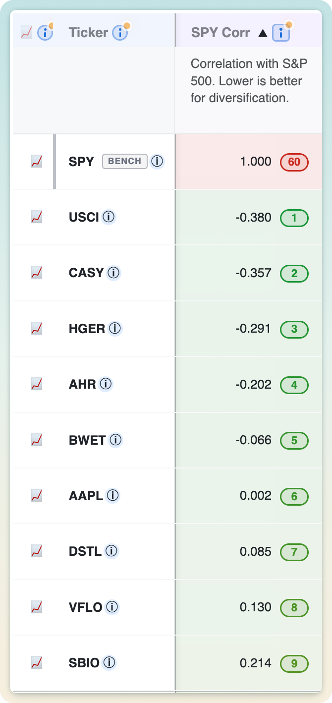
Tickers ranked by correlation with the S&P 500 for diversification analysis

Each ticker's correlation to the S&P 500 shows how much it moves with the market. Lower correlation means more genuine diversification. It's an easy way to build a basket that doesn't all sink together.

09

Unique ATH/ATL Trend Score for easier buy and hold

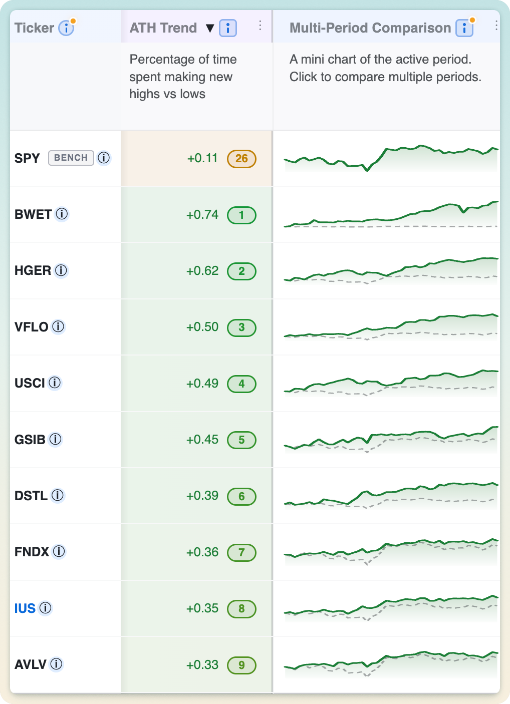
ATH Trend scores ranked alongside multi-period comparison charts

A signed score from −1 to +1 measuring how persistently a ticker keeps making new highs versus new lows over the period, weighted toward recent action. Strong positive scores flag relentless uptrends that tend to reward patient buy-and-hold.

10

Compare current and global drawdown

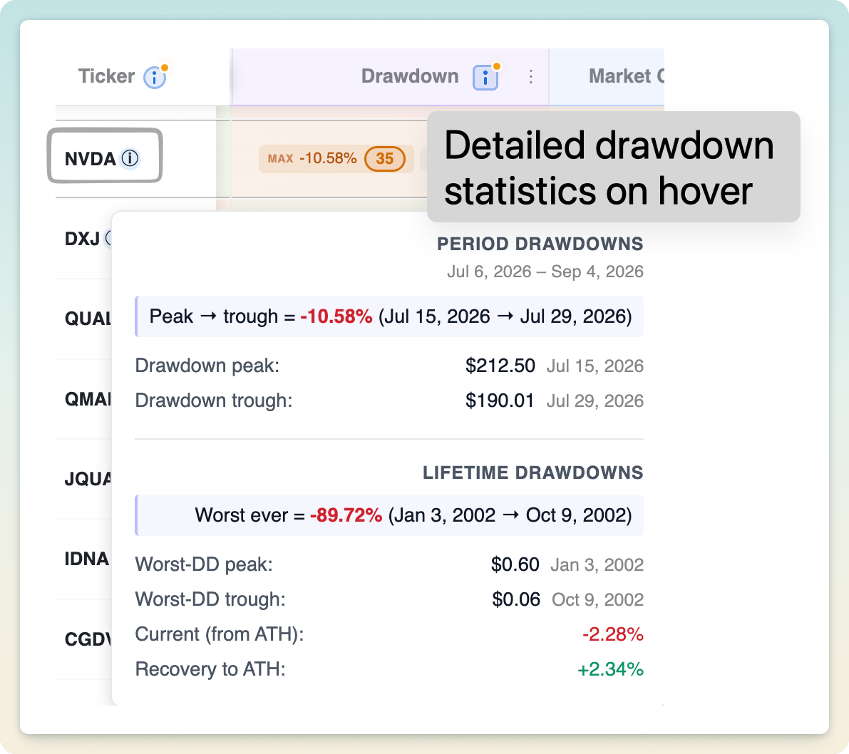
Detailed period, lifetime, and current drawdown statistics

See both how far a ticker currently sits below its high and the worst peak-to-trough drop it suffered during the period. Together they show today's pain versus the deepest hole it has dug, a realistic downside picture.

11

Advanced compute engine: realtime metrics, not just end-of-day

A purpose-built engine recomputes the full metric set in real time using live intraday prices, not just yesterday's close. Change a ticker or timeframe and every number updates in milliseconds.

12

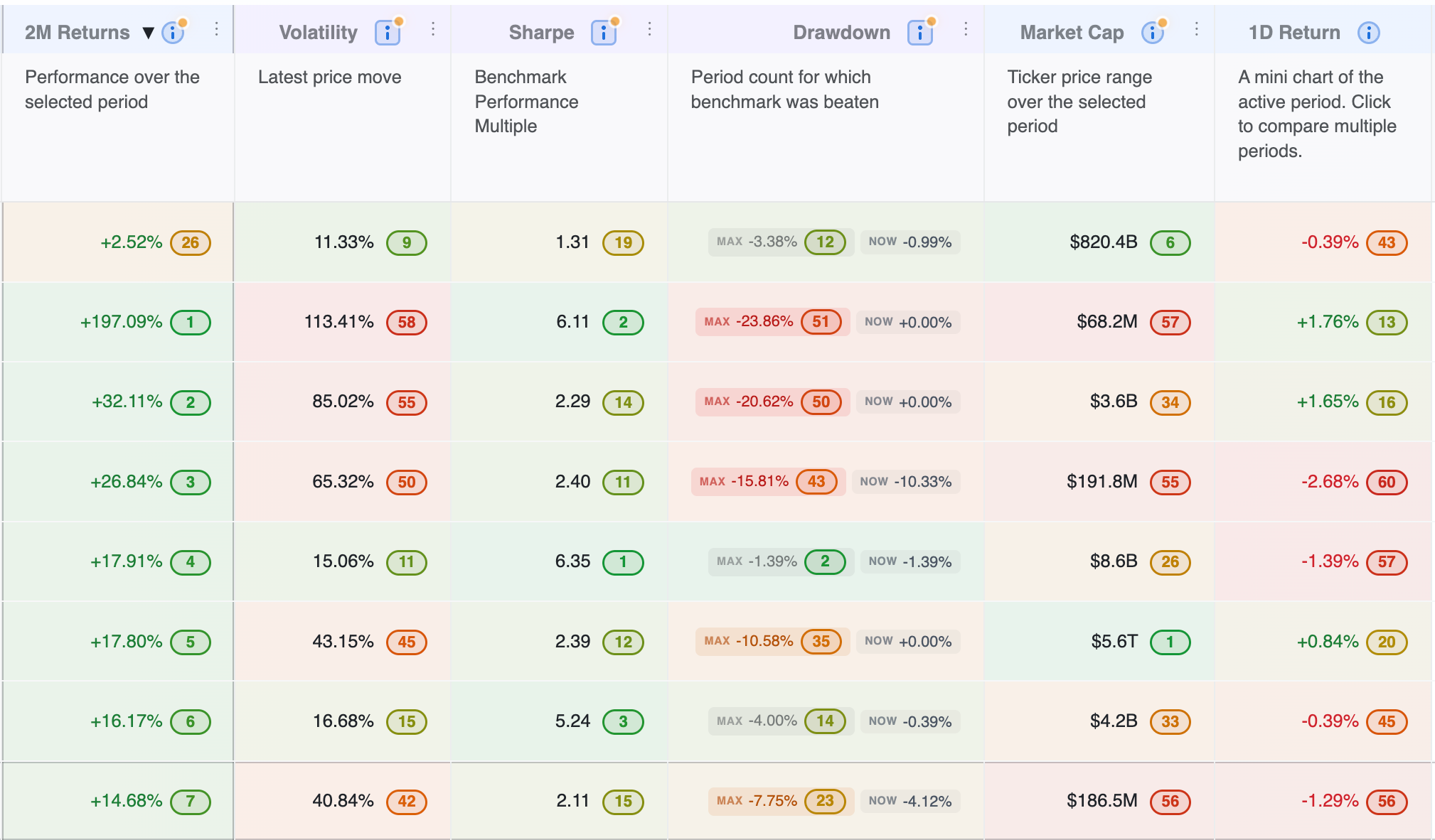
Multi-period metrics

Price range, multi-period comparison, and multi-period rank cells shown together

Add return columns for any set of periods (1M, YTD, 1Y, 5Y, and beyond) to compare performance across many windows without leaving your current timeframe. Each period is ranked on its own for true cross-window comparison.

13

Smart Help to explain why each column matters

Plain-English volatility explanation with visual risk and position-sizing guidance

Every column carries a plain-English explanation of what it measures, the trade-offs involved, and when it matters. Learn as you go and uplevel as an investor, no finance degree required.

14

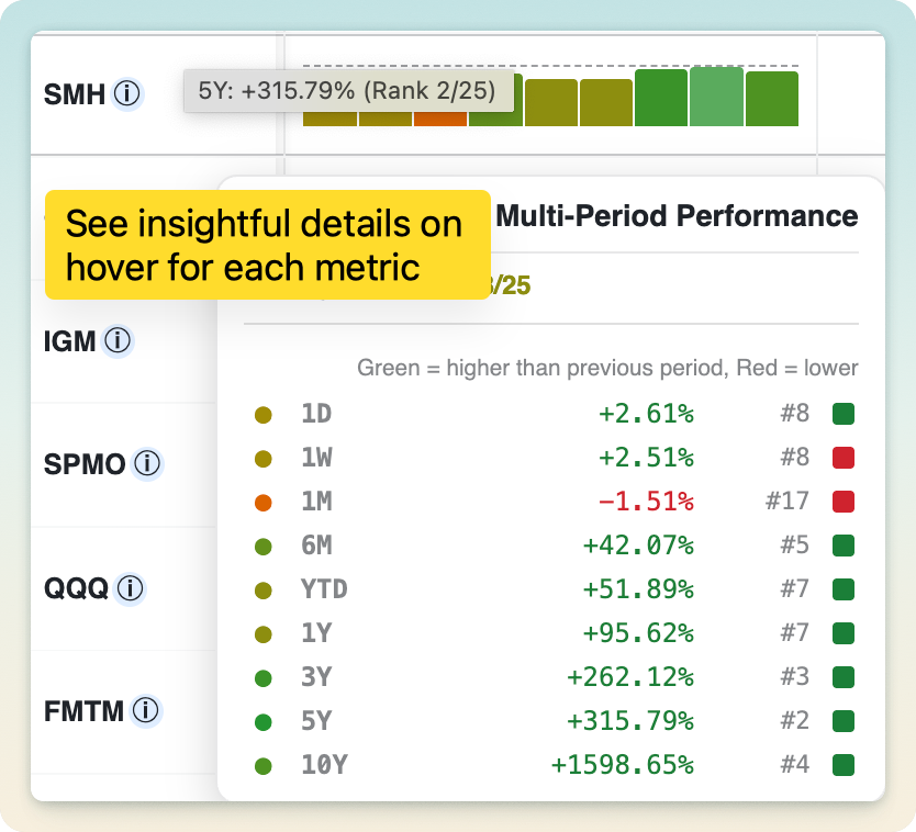
Smart Hover Intelligence

Detailed multi-period performance information revealed by hovering a ranking cell

Hovering any cell reveals the detail behind the number: start and end prices with dates, the all-time high behind a drawdown, or a per-interval breakdown of a trend score. The metrics stay inspectable instead of opaque.

15

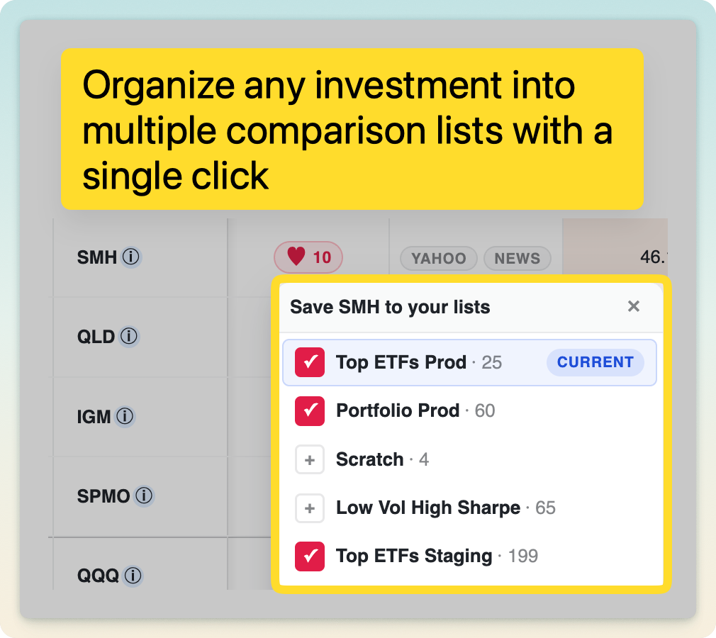
Detailed curation: add or remove tickers from any watchlist

Saving a ticker to one or more comparison watchlists

Add or remove tickers from any of your watchlists with a quick picker, right from the table. Build and refine multiple comparison lists without breaking your flow.

16

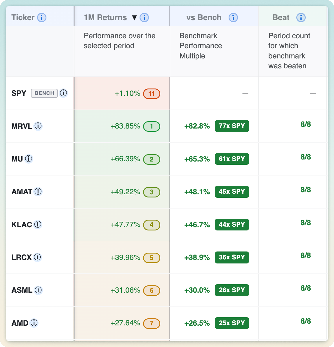
Comparison metrics to any benchmark, with a Beat Score

Benchmark-relative performance and Beat Score columns in the rankings table

Set any benchmark (SPY by default) and see each ticker's outperformance against it, plus a Beat Score counting how many of your selected periods it actually beat the benchmark on. It instantly separates genuine market-beaters from closet trackers.

17

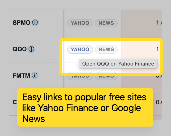
Links to Yahoo and Google

One-click ticker links to Yahoo Finance and Google News

One-click shortcuts on every row jump straight to Yahoo Finance and Google for deeper research. Go from spotting an interesting ticker to reading up on it without hunting for the symbol.

Convenient workflow, presets, and organization tools for effortless daily clarity.

01

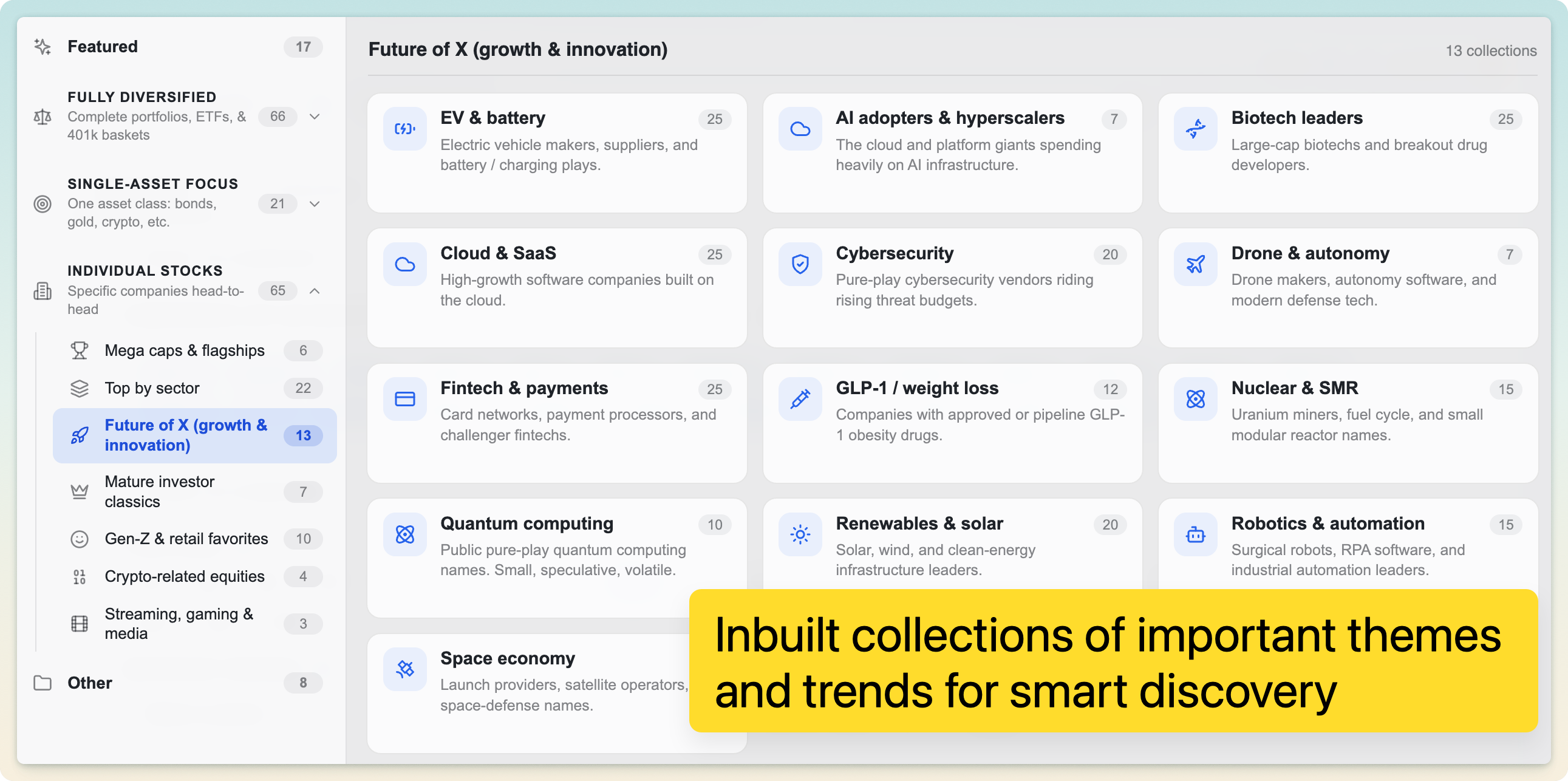
A large library of pre-curated comparison watchlists

Ready-made comparison collections organized across investment themes and trends

A large library of carefully chosen watchlists spans many themes: diversified portfolios, sectors, single-asset deep dives, and timely scenarios. There's always a meaningful comparison to open, so you never start from a blank slate.

02

In-depth access to 15,000+ US market assets

Compare any of 15,000+ US stocks, ETFs, and mutual funds, with decades of daily history behind each one. If it trades on a US exchange, you can put it side by side with anything else.

03

Minimal effort: add tickers, and the app does the rest

Just add tickers with a fast picker and EasyCompare handles the charting, ranking, and metrics for you. Your list is auto-saved on every change, so nothing is ever lost.

04

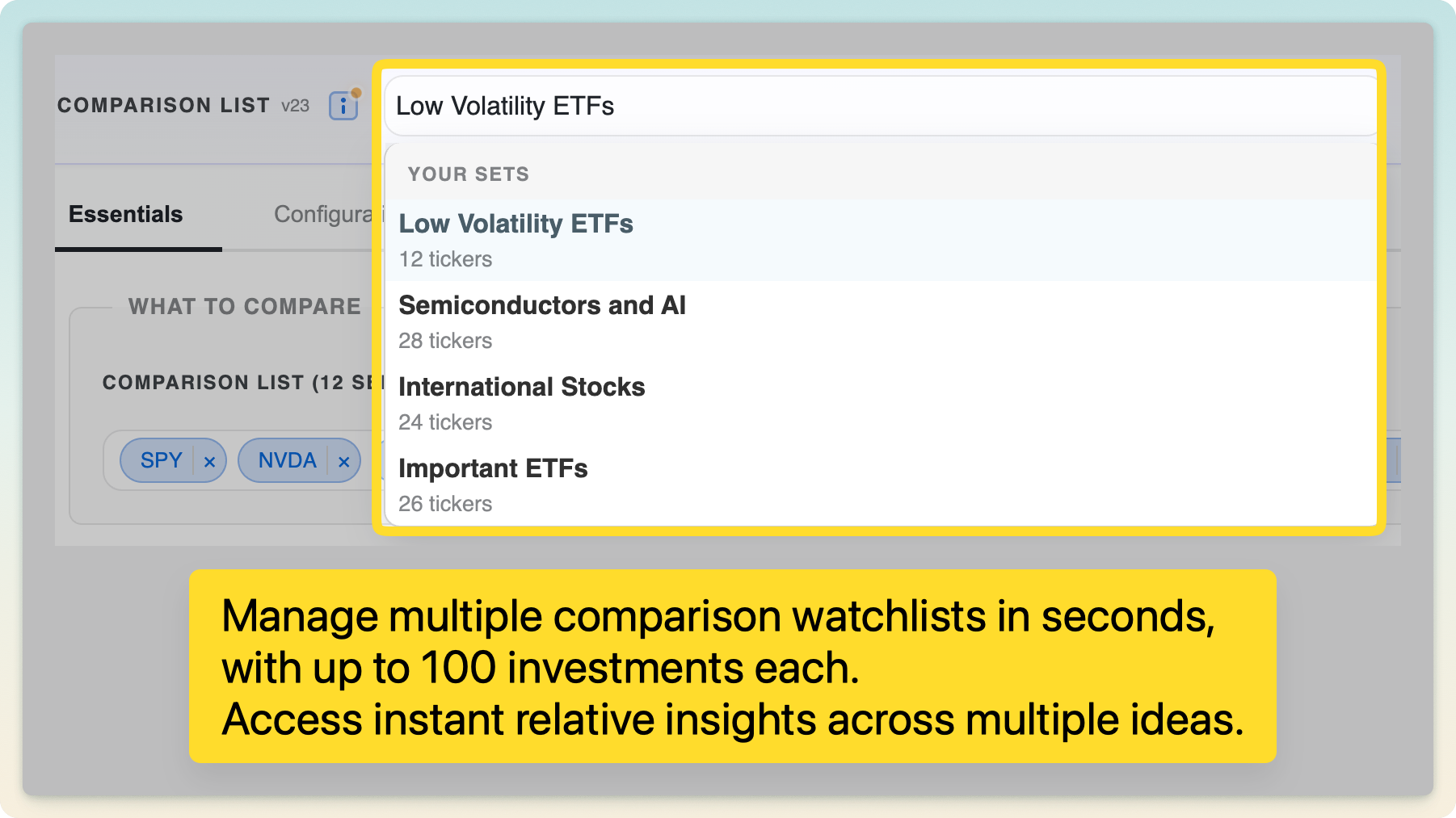
Curate as many watchlists as your ideas need

Switching among multiple independently curated comparison watchlists

Maintain many independent watchlists side by side (one per portfolio, strategy, or idea), each with its own tickers, timeframe, and settings. Switch between them in a click without losing context.

05

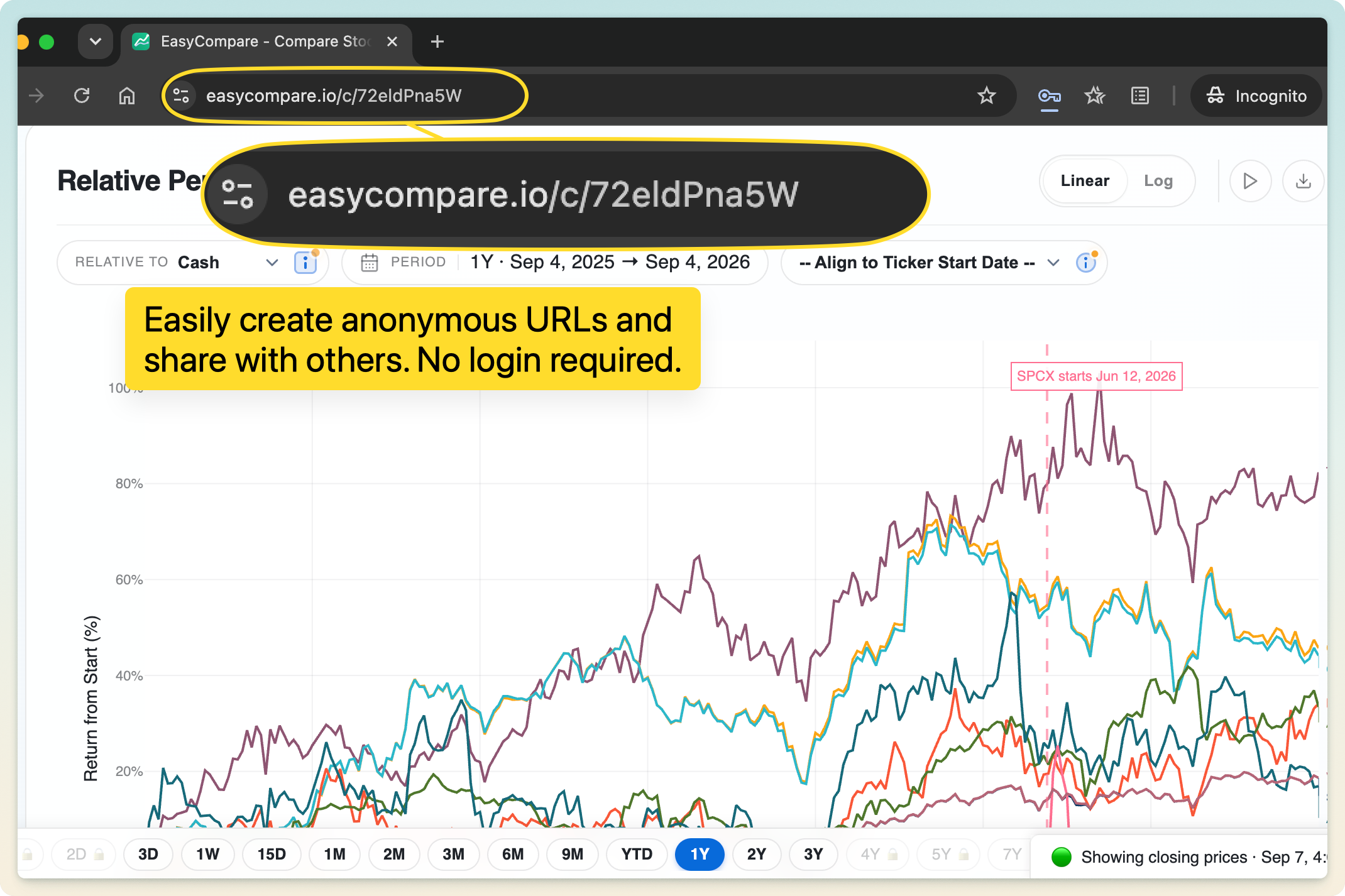
Anonymous, pastebin-style saved sessions

An anonymous EasyCompare session saved at its own URL without requiring login

Every session saves automatically and lives at its own shareable link, no account required. Come back later or open it on another device and your comparison is exactly where you left it.

06

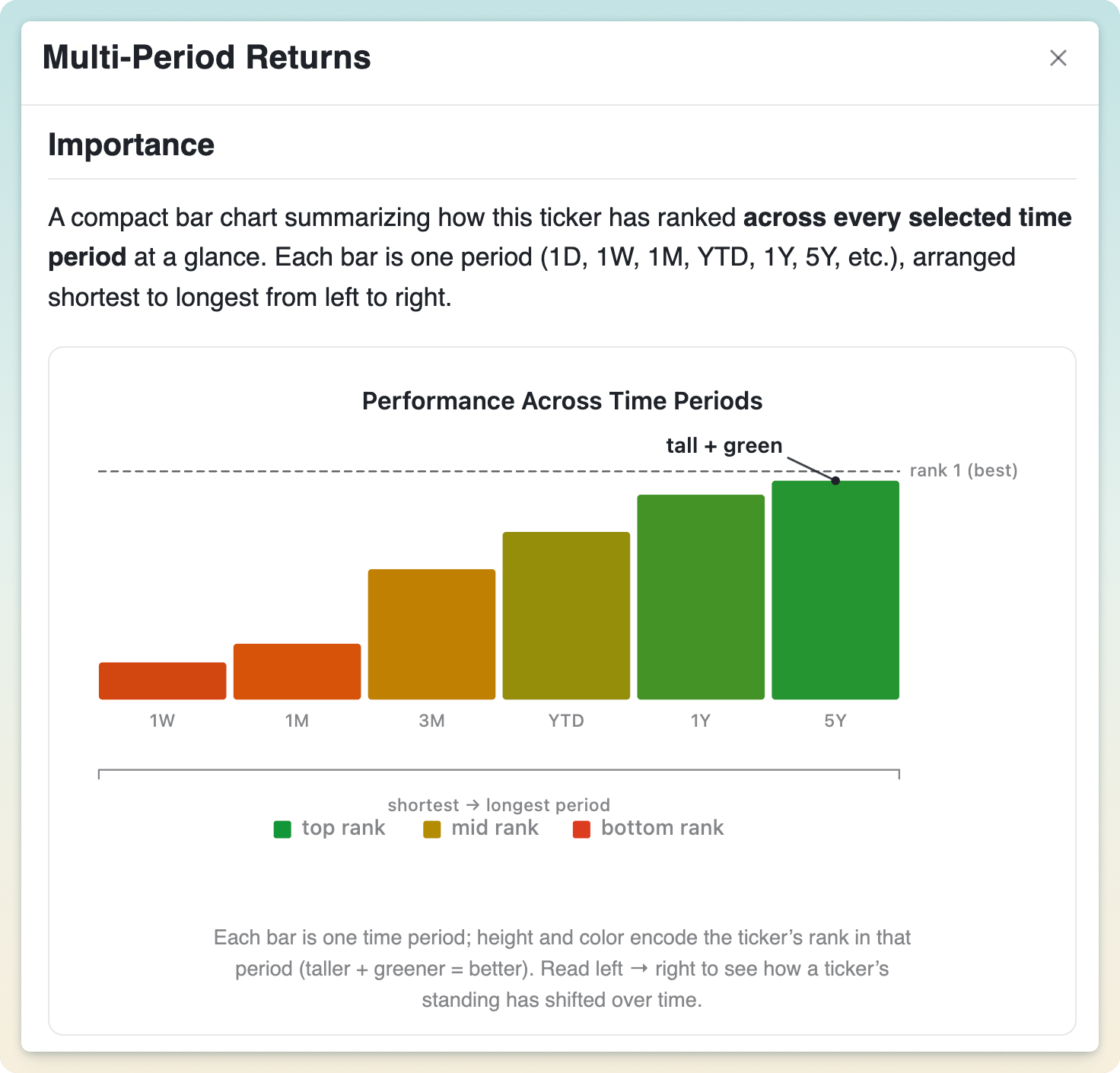
A strong focus on in-app education

An in-app explanation showing how to interpret multi-period return rankings

EasyCompare gently introduces intermediate-to-advanced quantitative concepts right inside the interface, with plain-English help on every metric and control. You level up as an investor while you work.
07

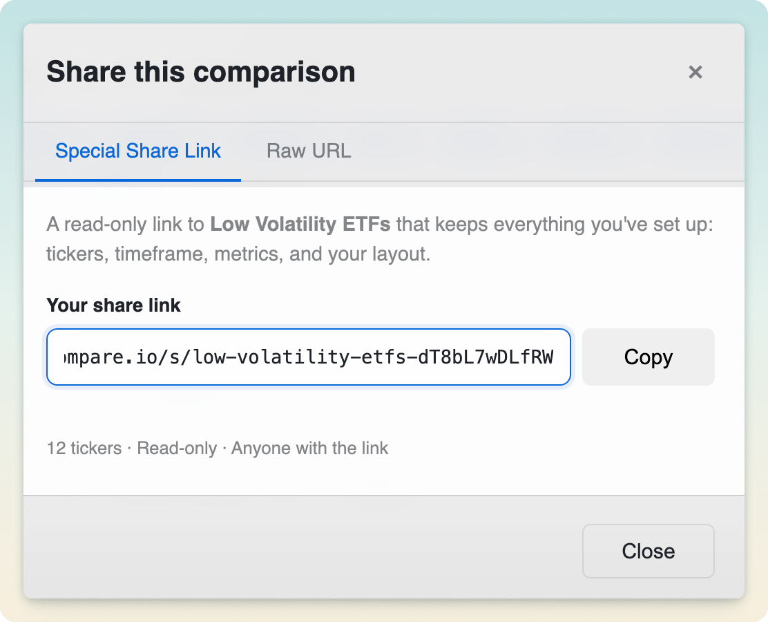
Easy sharing in a single click

Creating a read-only share link for a complete comparison session

Share any comparison session with one click and collaborate on investing ideas. Recipients see exactly what you see (tickers, timeframe, and settings), with no login needed.

08

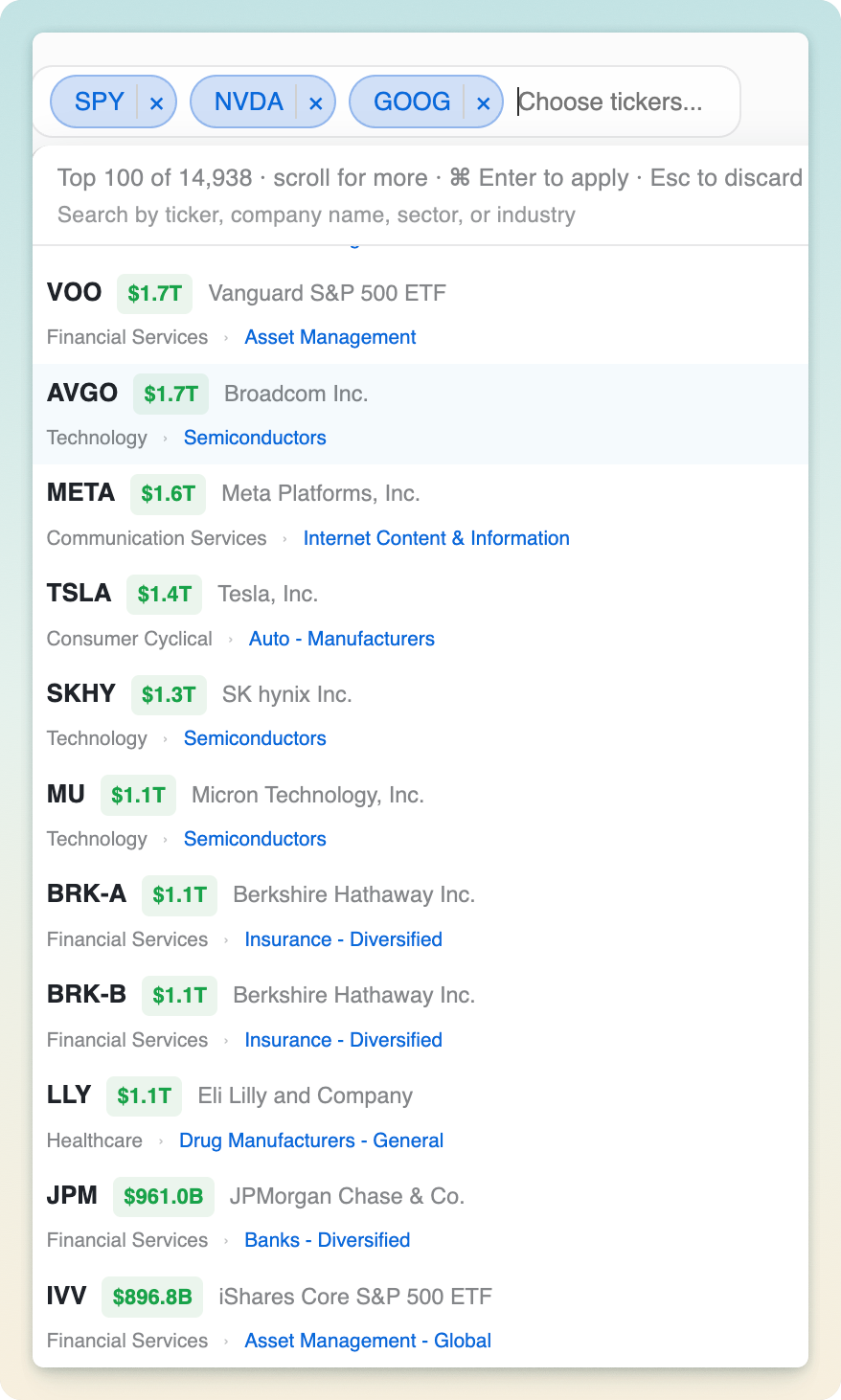
A detailed ticker picker, sorted by market cap

Ticker picker with company, market cap, sector, and industry metadata

Search by symbol, company name, sector, or industry. Type "semiconductors" to pull up every semi stock and ETF. Results are sorted by market cap, so the biggest, most relevant names surface first.

09

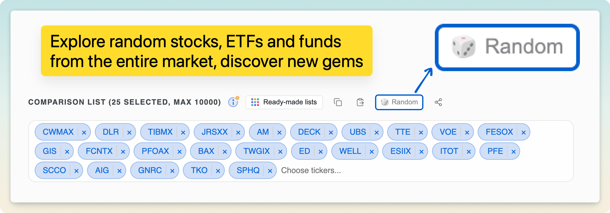
Randomize for infinite discovery

Randomize control for generating a fresh comparison from the full market

Generate a random set of tickers to compare for instant, serendipitous discovery, a great way to stumble onto an idea when you don't know where to start.

10

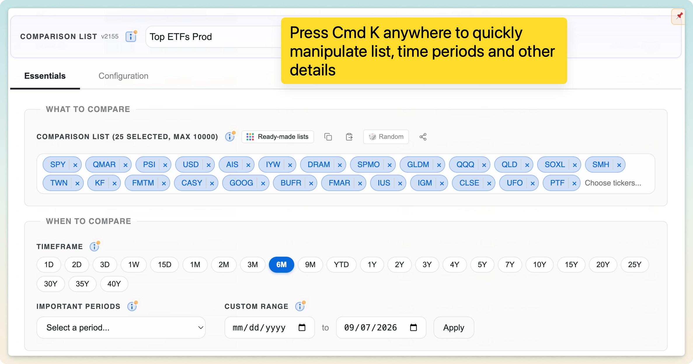
Cmd/Ctrl + K to change inputs instantly

Cmd K comparison picker for changing tickers, periods, and settings

Press Cmd/Ctrl + K anywhere to open a command palette and change tickers, timeframe, and settings without reaching for the mouse. Ideal for keyboard-first workflows.

11

A bottom toolbar to switch time presets anywhere

A slim toolbar pinned to the bottom lets you switch time presets instantly from anywhere in the app, without scrolling back up to the controls.

Realtime metrics, powered by a professional-grade compute engine.

01

An advanced compute engine for millions of realtime metrics

EasyCompare runs on an advanced, professional-grade backend that computes many metrics across many tickers and time periods in real time. Every number is calculated against the latest intraday price series, not stale end-of-day data.

02

Frequent updates during market hours

Realtime metrics refresh throughout the trading day (every 5 minutes for premium users and hourly for everyone else), so your comparison keeps pace with the market.

03

Compare intraday trends, correlations, and divergences

Track how your watchlist moves intraday across 1-, 2-, and 3-day windows to spot trends, correlations, and divergences as they happen. Available in the premium tier.

Free for most. Genuinely affordable for everyone else.

Our mission is to empower every investor with more disciplined, intelligent investing and make wealth-building more accessible. To get there, EasyCompare offers a generous free tier and a highly affordable premium tier.

It's an invaluable tool for every portfolio size, from four figures to eight. We're the #1 users of our own product and manage sizeable portfolios with it, leveraging instant relative clarity across many dimensions.

Free

$0

No account required to get started.

  • Compare across 15,000+ stocks, ETFs, and funds
  • Interactive visual comparison and rankings table
  • Core quantitative metrics, including ATH/ATL Trend
  • Pre-curated watchlists and saved sessions
  • Realtime metrics updated hourly
Start Comparing